The Construction Page Layout stage is organized around pages and layers. Each page can include multiple layers, with every layer tailored to show the specific information and images you need.
Your plans can span multiple pages, each configured to your requirements. Any layers, pages, and other construction elements you create can be saved to the Construction Library to use on future projects.
Page Layout Overview Video 🎥
The first time you enter Construction Page Layout, you will configure your default settings.
To open this menu again, go to the Configuration Menu (press F7), open the 2D Settings tab, and click the Customize Page Layout button.
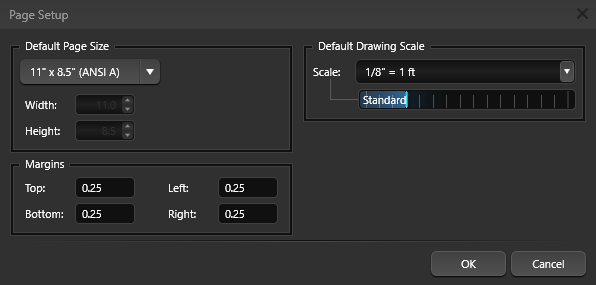
Your default page template appears on the screen. By default, this is the 11" x 8.5" template from the Library. You can create your own templates or set additional default pages. When a page is set as a default, it is automatically included in every new project you create.

In the Library, default pages are marked with a Star banner icon in the upper-left corner.
Any page with this icon will load automatically in every new file you create.
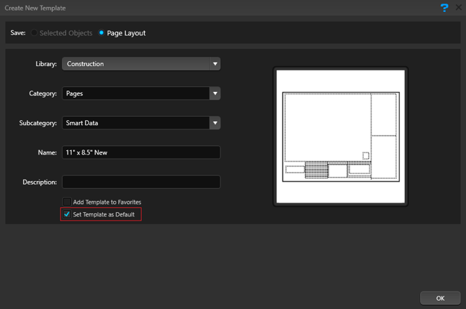
To create a new default page, first design the page as desired, then click the Save to Library button.
To have the new template load as a default, enable the default option in the Create New Template dialog.
Page System
Each project can include multiple pages for your plans. Each page may contain many layers and each layer may contain any type of object.
 Use the Gear icon to the right of the active page tab to edit an existing page.
When you click this icon, the Construction Page Options dialog opens and displays the current settings. From here, you can update the page name, page size, orientation, grid options, and margins.
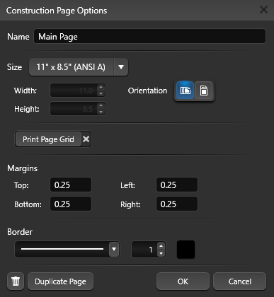
Name: Enter a clear, descriptive name for the page. Use a title that reflects the content or purpose of the sheet—for example, “Site Plan,” “Plumbing Layout,” or “Details – Section A.” A consistent naming convention makes it easier to navigate large projects, keep related pages organized, and quickly locate the correct sheet during reviews, printing, and revisions.
Size: Choose a page size from the drop-down list. To define a custom page size or margins, select Custom from the Page Size menu, then enter the desired Width and Height.
Orientation: Set the page orientation to Portrait or Landscape to match how you plan to present and print the sheet.
Print Page Grid: Enable this option to include the division grid when you print the page.
Margins: Margins are the blank spaces along the top, bottom, left, and right edges of the page. To set them, enter values in the Top, Bottom, Left, and Right fields.
Border: Add a border to your page and define the line style and thickness.
Duplicate Page: Create an exact copy of the current page, including all layers, objects, grid settings, margins, and borders. Use this when you need a consistent layout for multiple sheets—such as separate pages for plumbing, electrical, and details based on the same site plan—so you can reuse your formatting and title block without rebuilding the page from scratch.
Add New Page
To add a new page, click the New Page button at the bottom of the virtual paper. This opens the Construction Page Options dialog.
Enter a page name and choose a page size from the drop-down list. To define a custom page size or margins, select Custom from the Page Size menu, then enter the desired Width and Height. Set the page orientation, enable Grid Options if you want to print the construction grid, adjust the margin values, and add a border if needed.
Click Create Page when you are finished.
Reorder Pages: To change the page sequence, click and drag a page tab at the bottom of the screen to a new position.
Page Layout Grid
Use the construction grid to keep every page consistent.
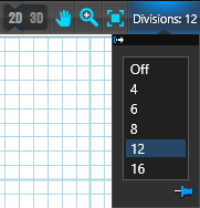 When the grid is enabled, objects and text snap to the grid as you move or resize them, making it simple to align all content on the page.
Division drop-down: Turn the grid on and control the spacing. The Division value sets how many segments the page is divided into, with each square representing one division of the page.
Using a Page Template to Create a New Page
In the Construction Library, select the Pages category. The List View will display all available page templates, and the Thumbnails panel will show a visual preview of the selected template. When inserted, each template brings in all of its saved page settings.
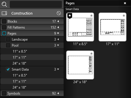
From the list, double-click a template name or thumbnail to add that template as a new page in your project. By default, the new page will use the template’s Library name; click the Gear icon on the active page tab to rename it.
Save Page as Template
Click in the dark gray area outside the virtual paper to clear any selection. Confirm that nothing is selected in the viewport, then click the Save button.
The Create New Template dialog will open and display a preview image of your template.
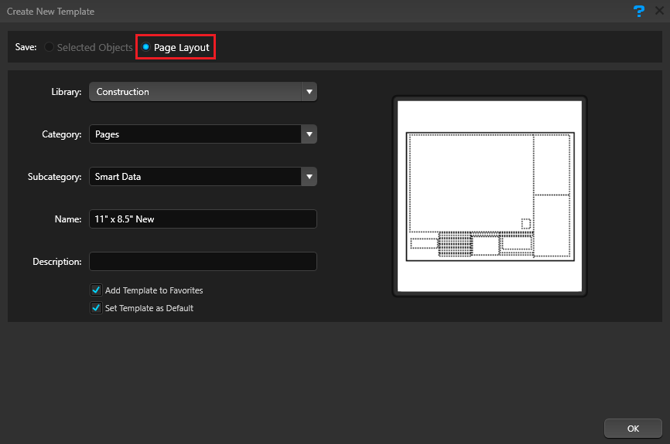
To have this page load automatically in every new project, select Set Template as Default. Click OK to confirm and save your changes.
Layer System
The Page Layout stage uses a page-and-layer system. Each page can include multiple layers, and every layer can contain any type of object. Layers may hold 2D views of the design, text, symbols, images, and other construction details. You can edit each layer or page independently.
 Pencil: This icon marks the active layer you are currently editing. Any new lines or objects added in the 2D Viewport are placed on this active layer.
To move a line or object to a different layer, copy it (Ctrl+C), click the target layer to make it active, and then paste (Ctrl+V). The layer must be active before you can edit it.
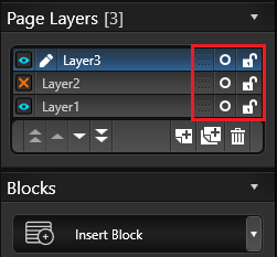
Blue Eye: This icon indicates a visible layer. A layer must be visible to be edited.
Orange X: This icon indicates a hidden layer. Clicking a hidden layer makes it active and reveals its contents.
Layer Controls
The primary Layer System controls are located under the Page Layout tab in the Panel. By default, a new project starts with a single layer. Click the arrow to the right of the Layers tab to expand or collapse the list of layers.
Drag: Use the Drag Layer handle (the small dots to the left of the Lock icon) to change the layer order. Hold down the left mouse button and drag the layer up or down in the list to adjust its stacking position.
O: Click this icon to the right of a layer name to instantly select all objects on that layer.
Lock: The Lock icon to the right of each layer indicates whether that layer is editable. An open lock means the layer can be edited; a closed lock means the layer is locked and its contents cannot be selected or modified.
Lock layers that contain information which does not change from project to project—such as company information or title blocks—to prevent accidental edits.
Layer Stack Order
You can change the stacking order of the layers by dragging the layers up or down the list or pressing one of the four Stack buttons in the bottom left of the layers panel.
 Double Up Arrows: Move selected layer to top of visual stack.
Up Arrow: Move selected layer up one position in visual stack.
Down Arrow: Move selected layer down one position in the visual stack.
Double Down Arrow: Move selected layer to bottom of visual stack.
Add, Duplicate and Remove Layer
The buttons located at the bottom of the Layers list allow you to create a new layer, duplicate an existing layer and remove an existing layer.
 Create New Layer: The New button adds a new layer to the list.
Duplicate Existing Layer: The Duplicate button creates copies of selected layers. Duplicating a layer also duplicates all objects on the layer.
Remove Existing Layer: The Delete button Remove will remove a layer from the Layers list.
Insert Block
Create new block types by choosing an option from the Insert Block drop-down list.
 Choose the specific type of block you want to add—such as a 2D View, 3D View, image, logo, text table, Smart Data Block, or one of the available legends.
After inserting a new block, you can reposition it using the Move tool.
To learn more about each block type, see the Blocks help page.
2D View Scale and Position
Every 2D View placed on the virtual paper can use its own scale. You can pan the view and set a specific scale for how it will print.
 Pan: The 2D View Pan tool is shown as a hand icon with four arrows. Click this button to change your cursor to a hand, then hold the left mouse button and drag to move the view inside the 2D View frame.
Opacity: Opacity controls how transparent an object is. Adjust the opacity of 2D Views, 3D Views, Images, and Logos to let more or less of the content beneath them show through. The
Opacity slider is a way to present before-and-after comparisons, emphasize a detail, or use your logo as a subtle watermark.
Scale: Use the dropdown or slider to change the scale of the 2D View. Drag the slider, or click the drop-down arrow to choose a specific standard or engineering scale from the list.
Custom Scale: Select Custom Scale to open the Custom Scale dialog and enter an exact scale value for the active 2D View.
Zoom to Fit: Automatically centers the 2D View and adjusts its scale to include all visible layers from your design.
Object Settings
The Object Tab only affects selected lines or objects.
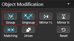
Group: Combine the selected lines or objects into a single grouped object. Once grouped, they move, rotate, scale, and copy together, making complex details easier to position and manage.
Ungroup: Break the selected group back into separate objects. If the group contains nested groups, they will be split into those smaller groups until all elements are individual again.
Note: If an object with a fill pattern is ungrouped, its fill pattern will be removed.
 Mirror Horizontally: The selected object will be mirrored horizontally.
Mirror Vertically: The selected object will be mirrored vertically.
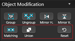
Matching: Click this button to select every object in the design that matches the currently selected object’s properties.
Union: Combine overlapping shapes into a single continuous shape. After using Union, the selected shapes behave as one object.
Reset: Restore the selected object to its original size and orientation. This clears any scaling or rotation you have applied and returns the object to its default state.
Visual Stacks
How objects and lines are stacked determines which ones appear on top when they overlap. In the Construction Page Layout stage, you can only select the top‑most object or line.
If you cannot select an object because it is underneath another, first select the object on top and move it below the one you want to access.
The Object Settings section of the panel includes four stacking buttons that let you change the order of overlapping objects. These controls are only available when an object or line is selected:
 Double Up Arrows: Move the selected object or line to the top of the visual stack.
Up Arrow: Move the selected object or line up one position in the stack.
Down Arrow: Move the selected object or line down one position in the stack.
Double Down Arrows: Move the selected object or line to the bottom of the visual stack.
Create & Save Symbols
Create new symbols by using the Line, Arc, and other drawing tools to build complete or incomplete shapes.
Save to Library: With your custom symbol selected, click Save to Library. The Create New Template dialog will open and show a preview of the symbol.

Add Symbols from the Library
You can add symbols from the Construction Library directly into the 2D Viewport.
In the Library, choose the Symbols category. The List View will display all available symbols, and the Thumbnails panel will show a preview of the symbol you select.

Surveys and Plot Plans as Background Images
Any background images inserted in earlier stages are also available in Page Layout and will display behind your design in every 2D View you create.
Each project can include up to four background images. Once added, a background image becomes part of the project, and you can easily toggle its visibility on or off in the 2D View Settings.
This is especially helpful when a survey or plot plan must appear on your construction plan to meet permit requirements. For more information, see Background Images.
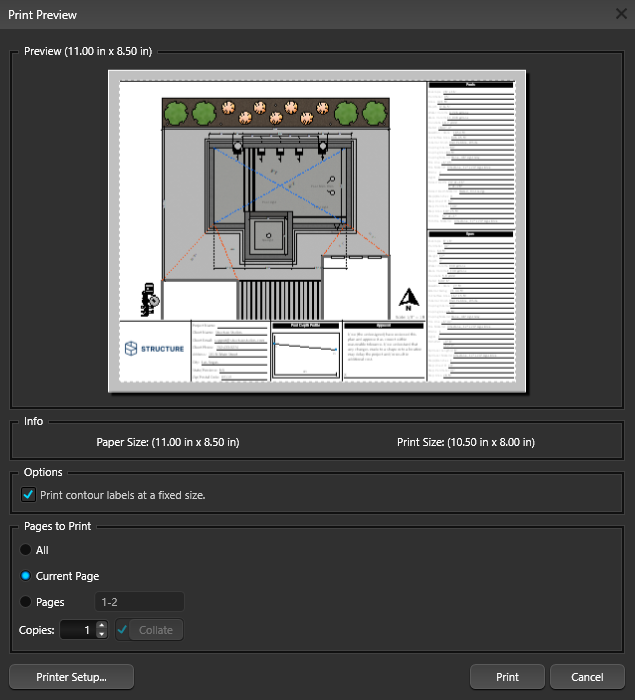
Printing in Construction
Choose Print from the Application menu to open the Print Preview window, which displays the current view of the active page.
The paper size is controlled by your printer’s paper settings. To change it, click Printer Setup and select a different paper size. When you are ready, click Print to complete the job.
Note: Each page in your construction plan must be printed individually.
Export in Construction
Selecting Export from the Application Menu will bring up the Export Options.
PDF: The PDF option in the Export menu will open the PDF Export dialog box. Here, you can select which pages you want to export. You have the flexibility to either combine all selected pages into a single PDF file or, export each page as a separate PDF by unchecking the combined option.
