The Construction Markup Stage lets you draw dedicated linework on separate layers, making it easier to edit, print plans, and apply global settings to specific layer types.
Use it to add guides, plumbing and electrical runs, callouts, and custom line styles. You can also draw and edit new shapes with the line, arc, and other drawing tools.
Markup Overview Video 🎥
Complete and incomplete shapes may be drawn in the Construction Markup Stage, but they will never appear in 3D.
Shapes from Design Stages may not be edited, though their line style may be changed under Object Settings and hidden by using Hide/Unhide.
Construction Markup Defaults
The line style, line color, fill pattern and fill pattern color of any shape may be set in the Construction Markup Stage.
 The Gear icon at the top right of the layer list, allows you to set default font, fill styles, line styles, colors and categories.
When you press the Gear Icon, the Default Markup Layers dialog will come up. The settings you select will apply to all new lines and shapes drawn on the layer and in future projects.

Here you can set your default Text Font and Measurement Font. When you set the font style and size for the Measurements and Text layers, those choices become your default settings.

Apply All Defaults: Use this option to apply all of your saved default settings to the current project.
Use 3D Materials on All Design Layers: Check this option to set 3D materials as the default fill style for all Stage Layers, uncheck the option to set a custom default fill style.
Construction Markup Layers
You can easily Hide and Unhide specific layers and all objects or lines contained within that layer by clicking directly on the Blue Eye, Blue box or empty box. The buttons located at the bottom of the Markup Layers allow you to create a new layer, duplicate an existing layer and remove an existing layer.
 Pencil or Paint Bucket: This icon will appear next to the Markup layer you are currently editing, the active layer.
Any new lines or objects added to the 2D Viewport will be assigned to your active layer.
If you need to move a line or object from one layer to another, copy it (Ctrl+C) click on the desired layer and paste (Ctrl+V). A layer must be active to edit it.
Blue Eye: This icon will appear next to visible layers. A layer must be visible to edit it.
Blank Square: This will appear next to hidden layers. When a layer is active, hidden objects and items on that layer will appear in purple. When that layer is no longer selected, the contents remain hidden.
Blue Box: This icon will appear next to layers on which some objects and/or items are hidden.

O: This icon to the right of the layer name will quickly select everything on that layer.
Lock: This icon to the right of each layer signifies if the layer is editable. An open lock signifies the layer can be edited. A closed lock signifies the layer cannot be edited and nothing on the layer can be selected.
It’s a good practice to lock layers as you complete work on them to avoid mistakes.
Restore: Restore default layer order.
Create New Layer: Create a new Markup Layer. You will be asked to name the new layer. Once the layer has been named, press OK to add it.
Duplicate Existing Layer: Copy the currently selected layer. You will be asked to name the copied layer. Once the layer has been named, press OK to add it.
Delete Existing Layer: Remove the currently selected layer.
Move to New Layer
Use the Move to New Layer button to send selected shapes and objects from any layer to a new custom layer.
 Select the shapes or objects you want to move, then click Move to New Layer.
In the drop-down menu, choose Move to New Layer and enter a name for the new layer, such as Existing Hardscapes or Existing Plants.
Move to New Layer: Move selected shapes and objects to a new custom layer.
Move to Original Layer: Return selected shapes and objects back to the original layer.
Markup Layers
Select a Stage Layer from the Markup Layers list. To set the default fill and line styles and colors, select the Fill Style and Line Style from the drop down lists.
Use 3D Materials on all Layers: Check this option to set 3D materials as the default fill style for all Stage Layers, uncheck the option to set a custom default fill style.
Default Fill Style: The fill style is set by selecting a artistic style from the drop-down menu and a fill pattern type from the library. If you do not wish to have a fill pattern, select Basic Blank.
Default Fill Pattern Color: Once a default fill pattern is selected, you can set the fill pattern color by using the Color Wheel or HSV Tab. Note: Only Basic Fill Styles may be changed. Click on the Reset Color button to undo changes made with the Color Wheel.
Default Line Style: The line style is set by selecting a line style from the drop-down menu. If you do not wish to have a line style, select None.
Default Line Color: Once a default line style is selected, you can set the line color by using the Color Wheel or HSV Tab.
Fill Pattern, Fill Style and Line Style of Selected Shape
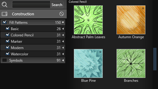
Select a new Fill Pattern from the Fill Patterns Category in the Construction Library. A list of Fill Patterns will appear in the List View and a preview of the selected fill patterns will appear in the Thumbnails Panel.
Applying Fill Pattern: Fill Patterns may be applied by double left clicking on the name or preview picture or using the Insert buttons.
Change the fill style, fill color, line style, and line color of a currently selected line or shape in the Panel under Object Settings.
Fill Options
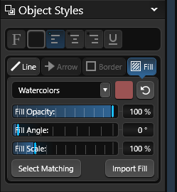
Changing Fill Style: The fill style may be changed by selecting a different Artistic Style from the drop-down menu in the Panel under the Fill Styles Tab.
Changing Fill Opacity, Angle and Scale: The fill pattern opacity, angle and scale may be changed by using the sliders.
Changing Fill Pattern Color: The fill pattern color may be changed by single left clicking the Color Square
Select Matching Fills: Press this button to select all shapes that contain the currently selected fill pattern. This is a quick way to select or change multiple shapes.
Import Fill
With the Import Fill option, you can import images to create your own custom fill patterns. You can even save these fill patterns to your Library to use in future projects.

Line Options
Changing Line Style: The line style may changed by selecting a different line style from the drop-down menu
Changing Line Color: The line color may be changed by single left clicking the Color Square
 Embed Text: Selecting Embed Text will add text to a line drawn in markup. Enter the word or phrase you would like to appear in your line.
Next set the distance for spacing between the word or phrase. The text font and font size may be changed by single left clicking the Font button.
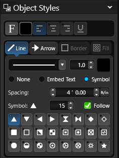
Symbol: Selecting Symbol will add a symbol to a line drawn in markup. Select the symbol you would like to appear in your line and set the size.
Next set the distance for spacing between the symbol.
Turn On Follow, to have the symbol follow the direction of the line.
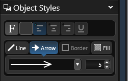
Arrow Style and Size: The arrow style and size may be changed by selecting a different arrow style from the drop-down menu and setting the size.
Displaying Measurements
By default, shapes do not display measurements. You can control measurement settings in the Panel under Object Settings.
You can also add additional measurements and data using the Measure and Text tools in the Panel.

Measurements: To display measurements for any selected shape, check the Display Measurements box. Clear the box to hide them.
Radius Measurements: To display radius values for any selected shape, check the Display Radius Measurements box. Clear the box to hide them.
Height Label: To show the height label in 2D view and in Construction, check the Height Label box.
Special Rulers
To measure an object such as a freeform pool, select the pool and click either the Triangulation Ruler or Centerline Ruler button.
 A new Markup Layer is created automatically, with measurement lines and a green border outlining the selected shape, ready for you to edit, adjust, and print.
For information see, Triangulation and Centerline.
Object Modification

Group: Combine the selected lines or objects so they behave as a single object, making them easier to move and keep organized.
Ungroup: Break a selected group back into individual objects. If the group contains smaller groups, those are also separated. Once ungrouped, each item becomes an individual object again. If an object includes a fill pattern and is ungrouped, its fill pattern will be removed.

Mirror Horizontally: Flip the selected object horizontally.
Mirror Vertically: Flip the selected object vertically.
NOTE: Only Markup Layers can be Grouped, Ungrouped and Mirrored.

Matching: Selects every object in the design that matches the currently selected object.
Union: Combines selected overlapping shapes into a single shape.
Reset: Restores a rotated or scaled object to its default state, removing all transformations.
Visual Stacks
How objects and lines are stacked controls how they appear when they overlap. In the Design Stages, you can select an object even if it is hidden beneath another. In the Construction Markup Stage, you can only select the topmost object or line.
If you cannot select an object or line because it is underneath another, first select the top object or line and move it below the one you need. You can adjust the stack order by typing a new value or by using the four Stack buttons in the Panel.
When an object is selected, stack controls appear under Object Settings, showing that object’s position in the stack on the active layer. For example, if a House is selected, you will see where it falls among all House shapes.

Double Up Arrows: Move the selected object or line to the top of the visual stack.
Up Arrow: Move the selected object or line up one position in the visual stack.
Down Arrow: Move the selected object or line down one position in the visual stack.
Double Down Arrow: Move the selected object or line to the bottom of the visual stack.
Change Stack Order: Type in a new value in the first field or use one of the four stack buttons.
Add Measurement Lines
You can add new measurement lines in Markup using the Measure Tool found under Tools in the Panel. All measurements are automatically placed on the Measurements Layer.

Font: Adjust the measurement text font and size using the Font drop-down menus.
Line Style and Size: Choose a different line style and size from the Line Style drop-down.
Line Color: Change the line color by clicking the Color Square.
Arrow Style and Size: Choose a different arrow style and size from the Arrow Style drop-down.
 Display Measurements: To display measurement line text, select the Measurements checkbox under Visibility.
To hide the text, clear the checkbox.
Add Text
You can add new Text in Markup using the Text Tool found under Tools in the Panel. All text is automatically placed on the Text Layer.
You can edit any text you add or insert from the Library by double-clicking it.

 Font Style and Size: Adjust the text font and size using the Font drop-down menus. Or click the Font button to open the Font Dialog for additional options.
Color: Click the Color Square to the right of the Font button to change the text color.
Align Tools: By default, text is left-aligned. Click one of the Align buttons to align text left, center, or right.
U: Click the U button to toggle underline on the selected text.
Label Text: Label Text: Select Label Text to create a form-style label with lines for information. The label appears on the left, with entry lines on the right. Double-click “Label” to type your own label, then double-click the first line to enter information. Press Enter to move to the next line.
Label Underline: Turn Label Underline on or off to add or remove the underline to the right of the label text.

Border Style and Size: Choose a border style from the drop-down menu and set the size. To remove the border, select None from the list.
Border Color: Click the Color Square to the right of the Border Style drop-down to change the border color.

Call-Out Arrow: Select Add Call-Out Arrow to attach an arrow to the text. Use the Move Tool to position the arrow anywhere in the viewport. Drag the center point of the arrow to bend it. You can add multiple callout arrows to a single text box.
Callout Arrow Style and Size: Choose a different arrow style from the drop-down menu and set the size.
Image Callouts
With the Callout Tool, you can also add photos to plants and items. This is a great way to share your plant palette and project details with your clients.
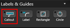
1. Select the Plant, Tree or Library object, then Callout.
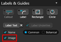
2. Next check the box for Image.
3. Double click on the image in the callout to access the menu, or click Edit in the Library.

Assign the Image:
You can select images saved on your PC, click Online Search to look for new images, or drag and drop images from your browser.
- Browse PC: Clicking on Browse PC will bring up a file selection box. Graphic files in the .BMP, .PNG, .JPG, or .TGA formats may be used.
- Online Search: Clicking on Online Search will open your default browser, and search for the Botanical name or Template Name of the object. The image can be saved to the PC, or dragged into the “Drag image here” area in the object menu.
NOTE: You may need to view the original image before dragging. Click to view the larger preview of the image in your browser, then View Image. Some images cannot be dragged or saved, depending on the website’s security settings.
Change Label Guide
The Label guide lets you reposition measurements in your plan. Click and hold a measurement to drag it along the line or pull it away with a callout line.

Font: Pick Font allows you to change the font and size of the label text.
Color: The text color may be changed by single left clicking the Color Square located to the right of the Font button.
Hide/Unhide: Clicking the Hide Selected button in the Hide/Unhide menu will hide the selected label.
Create and Save Symbols
You can create new symbols with the Line, Arc, and other drawing tools by designing complete or incomplete shapes. These symbols can be used in your construction plans and assigned to Library items, including plants and trees.
Save to Library: With your custom symbol selected, click Save to Library. The Create New Template dialog will open and display a preview of your symbol.
Be sure to select the correct symbol type:
-
Click Template to save a general symbol for use in Construction Markup or Page Layout.
-
Click Item Symbol or Plant Symbol to save the symbol as the corresponding item or plant type.

Symbols from the Library
Symbols from the Construction Library may be added to the 2D Viewport on Markup Layers.

In the Library, select the Symbols Category. A list of symbol templates will appear in the List View and a preview of the selected symbols will appear in the Thumbnails Panel.
Symbols from the list may be inserted by double left clicking on the name or preview picture or using the Insert One or Insert buttons.
Surveys and Plot Plans as Background Images
You can insert a background image in Stage 1: Project Information or from the Import option in the Application Menu.
This is especially helpful when a survey or plot plan must be shown on a construction plan to meet permit requirements.
Any background images added in earlier stages will also appear in the Construction Markup Stage and will keep the scale you originally set.
For more information, see Background Image.
Print in Construction
Select Print from the Application Menu to open the Print Preview window showing the current view of the selected page.

Export in Construction
Select Export from the Application Menu to open the Export options.
PDF: Choose PDF to open the Save PDF dialog. Select a location and click Save to create a .pdf file.
2D Image: Choose 2D Image to open the Save 2D Image dialog showing the current view of the selected page. From here, save the view as a .png image.
